Monday, June 18, 2012

Let's get this party started...

DZ Design & Interiors also is involved in event design. In the past couple months I have been so honored to be a part of 3 amazing events. I have the best clients!

FPS (Flexible Power Symposium)


FPS was a week long event at the beginning of April, which was held at the beautiful Westin La Cantera in San Antonio, TX. This was actually an event full of smaller events. I designed an opening dinner for 110 people, the set design and ballroom selections for a 2 day seminar, and then another amazing dinner at Picosa Ranch (outside of San Antonio)


Opening Dinner Floral designed by DZ


Picosa Ranch Dinner Floral designed by DZ

Kingspoint Marine Merchant Academy Ceremony

The Kingspoint event was a ceremony reception given to Kinspoint Academy, in Kingspoint, NY, by my clients to formally acknowledge their donation of a ship propellor and shaft. I was able to design the evening event's food selections, lighting, and assist in graphic designs as well.


NASDAQ Opening Bell Ceremony

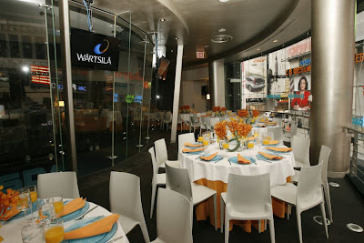
My corporate client had the opportunity to ring the NASDAQ opening bell, and so I designed a brunch that followed the ceremony. My inspiration was their branding colors, and the freshness of Spring.


Monday, June 11, 2012

Chandeliers and Pendants: They're NOT just for the dining room and foyer...

Save space on your bedside table and hang mini chandeliers or pendants for a dramatic look. In many cases, hanging your light source also helps in balancing rooms with high ceilings by pulling from the top half, when normally spaces can tend to feel a little bottom heavy because of furniture (and, of course, gravity!)


Have to get to work... More ways to use chandeliers coming later today...


Friday, June 8, 2012

7 Tips for Timeless, Tasteful Permanent Florals

When it comes to fake plants and flowers, most people think of a faded, dusty ivy above their grandmother's kitchen cabinets, or a sad display of leggy stems that have been pushed to the back and forgotten about. We all want the look of fresh plants and flowers in our home or work environment, but the hassle and expense can be someone ridiculous. You CAN have the look with permanent florals and botanicals if you follow these tips...

Tip #1- If it doesn't look like you could pluck it out of your garden or could buy it from the market, don't waste your money! There's no need to settle for anything less with all of the resources we have today. Stay away from bright greens and over saturated florals- they just don't look real.

Tip #2- When designing florals, put the focus on an artful piece of driftwood or other natural element, rather than just all flowers. This will take the focus off of the actual plant, which will make the piece more believable.


The 2 pieces above were designed by me, and created by one of my fabulous vendors in Houston (For All Occasions).

Tip #3- Throw in a little bling. Add small detailing that make your piece unique and fun. 


The gold rocks in the pictures above add the perfect amount of metallic detailing to somewhat tone-on-tone pieces.

Tip #4- Use succulents, when possible, for the majority of your greenery. Also, spidery flowers also tend to look more real than petaled flowers. Succulents and cacti naturally have a rubbery look and texture, so they can be copied quite easily and successfully in the fake plant world!


Tip #5- Use other objects instead of florals to create the same effect. For example, different types of coral make quite a dramatic statement! The picture below is dressed as a floral arrangement, with a mood moss and rock base, but then a beautiful piece of white coral is the focal point, with airy fan coral floating above it! This makes quite a wonderful look.


Tip #6- Clustering single stems or grasses repetitively will give a believable, dramatic look. There is nothing quite more beautiful than a mound of your favorite flower. Short grasses can also be extremely cool looking when done in a straight row.You can mix the shades slightly for more depth, but keeping it all simple and the same usually results in the most stunning look. To make flowers look even more believable, stabilize stems in clear acrylic (you can buy at the craft store) and it will look like water.


This picture above was taken in one of the bathrooms I designed.


The grass installation above was done in an office space, dividing 2 sections of open workspaces. What a great feel this gives a space that would normally not have anything green!

Tip #7- Mix real and fake flowers for a very unique look! There are times when real flowers are more preferable, especially in table settings, so create a look you love with a mixture of both! The pictures below show several arrangements I've done with both! Can you guess which is real and which is not?? You won't be able to tell if you do it right!




Timeless Kitchen Trends

Double, mismatching islands...

A great way to bring style and more functionality into a kitchen is by adding an island that has a different look from the rest of the kitchen. Make your kitchen even more unique by adding TWO separate islands!


The above photo was taken at Subzero/Wolf headquarters in one of their demonstration kitchens. This kitchen was designed by Chicago-based kitchen designer, Mick De Giulio. You can see that the majority of the kitchen is very classic, with old world charm and aged elegance. Notice the two islands, which completely bring in their own unique charm, but add such depth to the entire design.


Notice the contrasting marbles- the floor features a classic checkered pattern with white carrera and black marquina marble, and the island is done in a beautiful black and gold (looks like it could be a select Michelangelo marble). Both the floor and the counter are honed (matte, lustrous finish) which go well with the old world style, and also the longevity of the product. The iron detailing adds a beautiful touch, and the openness of this island does not crowd the kitchen as a fully closed island normally does. 


The other island in this kitchen functions more as cutting board, and has a 12" butcher block top. Different from the other island, this one is much more stocky in appearance, but still brings in the black and golden mahogany tones. This contemporary design mimics the shape of 3 wine barrels, which fits into the rustic old world style. 


This next kitchen is very contemporary, and features sleek horizontal lines as its focus. It is also a Subzero/Wolf demonstration kitchen in Madison, WI, and was also designed by Mick De Giulio.


This kitchen also uses 2 separate, different islands, but they're still the same. The farthest island in the picture is done in a polished Calcatta marble, which has dramatic veining and contrasts nicely with the sleekness of the rest of the kitchen. The closest island is done in a darkened butcher block, which goes nicely with the espresso cabinetry, and brings in another rich wood tone. Both have the exact same base, which works excellently with the style of kitchen.


Tuesday, August 2, 2011

WHO would have known...


'WHO' would have known this bathroom remodel would have turned out better than ever expected??!!


You gotta have coral in your bathroom!


This bathroom is an eclectic mix of contemporary fixtures and classy traditional furnishings and details... 


Custom vanity to fit the shallow space designed and faux painted by DZ Design + Interiors

Before | After


Saturday, July 30, 2011